A Realistic Approach to Conservation

I believe nature to have both intrinsic and instrumental value. As humans continue to grow in numbers, the argument arises as to which value is more important. It is a fight that weighs people’s livelihoods against the intrinsic value of nature. The issue of conservation comes into play as people look find the most acceptable attributes (or species) of nature to neglect for their own self-interest. 

Dr. Marvier in her paper with Hazel Wong began by discussing the “Golden Era” of environmentalism, spanning from 1965 to 1980. During this period she attributed the passage of Clean Water, Clean Air, and Endangered Species Acts to strong public and bipartisan support. Such support does not exist today. Opinions on the environment have become “divisive and partisan” according to Marvier. The public views environmental regulation as threats to livelihood, which is not aided by Environmentalists vilifying farmers, miners, ranchers, loggers and fishermen. This feud is detrimental to the efforts of conservation, forcing people to choose between their wallets and the environment.

Public opinion on the conservation of species and nature is a matter of public ethics. As in the “Golden Era”, public and bipartisan support is necessary to achieve any substantial feats in conservation. Protecting the environment is expensive, and often comes at the cost of industry. In her paper, Dr. Marvier cites a survey in which 76.3% of 786 respondents agreed that “We can protect land and water and have a strong economy with good jobs for Americans at the same time, without having to choose one over the other.” (Marvier, Wong). In order to protect the environment without cost to the economy, there must be cooperation between environmentalists, both parties of government, and the industries that benefit from using the environment. The government cannot flip the bill of conservation on its own. However, it can create a combination of regulation and subsidies to encourage industries to handle their methods in a way that conservationists can be happy about. I believe this to be the most realistic approach to promoting conservation. People appreciate both the intrinsic and instrumental value of nature, however they will typically act in favor of self-interest, business is no different. To gain the support of the public, there cannot be the question of environment or economy. Due to the increase in human population and life-style standards, the conservation of species will require someone to take a loss. If the economy is not to struggle, it is the job of the government to distribute that loss between itself, industry, and the American taxpayer. Only then will people be able to feel enthusiastic about conserving the intrinsic value of nature.

Reference:

Marvier, Michelle & Wong, Hazel (2012) Resurrecting the Conservation Movement. Journal of Environmental Studies and Sciences, ISSN 2190-6483. doi:10.1007/s13412-012-0096-6


Art paper

The art piece that I will be studying is the one titled Taos Pueblo, by Karl Albert Buehr. The first thing that I noticed when I closed my eyes and opened them to look at the painting was the mountains in the background. The mountains go and reach up almost all the way to the clouds. The mountains reaching up nearly to the sky, might suggest mediation between mankind and their efforts, and nature that God has given to us. The second object of notice was the buildings that were built by man. These building show how we use resources from nature in order to help the survival of mankind. This part is especially important to the concept of the Antropocene because this helps us to see how we humans have always used the world’s natural resources for our survival, and that we have always manipulated nature in order to do so. However, from this painting, it seems clear that humans and nature, are not opposing forces, but that we all work in harmony together. I say this because the mountains in the picture seem to be this great mediator between the buildings built by man, and the clouds which are up in the sky. This just seems to show that nature and mankind are just one. This is unique to the common thoughts about the Antropocene because the Antropocene seems to show a concept of humans and nature as opposing forces, and that humans are in the wrong. There is also a tree in the background that looks somewhat out of place, and that is possible there in the picture as a representation of the ideal that humans and nature are opposed to each other in some respects because that tree is representative of the only place in the picture with green vegetation. This might show that the other trees that may have been there before people, where cut down to make room for other people’s houses. This might show humans and nature as opposing forces.

Displaying photo.JPG

Yosemite Valley

Image

Albert Bierstadt
U.S., b. Germany, 1830-1902
Yosemite Valley, n.d.
Oil on paper mounted on canvas
16 x 20 in.
Purchase, Richard H. and Adeline J. Fleischaker Collection, 1996

Fred Jones Jr. Museum of Art, University of Oklahoma

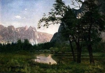
Yosemite Valley is a beautiful painting to represent the anthropocene. In fact, it is a beautiful painting in general, regardless of the anthropocene. The painter uses only a few colors in his artwork, but takes advantage of the many different shades of one color to create dimension and add depth to the painting. Only three colors: blues, greens, and greys make up this piece, giving it a more simple, peaceful look. In order to bring the focus to the front of the painting, Bierstadt uses more vibrant, darker colors, showing off the beauty of the untouched grass, river, and trees. In the back however, he has lightened the colors of the mountains with more cool tones like light blue and grey. Though the mountains are kind of pushed to the back of the picture, it does not take away the majestic feel, rather, I feel like it enhances the painting, pulling it all together. If you admire the few tress in the very front, right side, you can see that he is trying to keep the viewer from veering off the canvas. To do this, he guides your gaze alongside the base of the tree on the very right sending you up to the branches and leaves to the tree next to it. If you follow the path of those branches, they curve down, taking you straight down to the river. The river then curves back again to the base of the tree we started with, giving us a circular pattern.

The painting overall gives such a peaceful, innocent voice to nature, showing off its beauty that has been untouched by human hands. It makes me feel as if I were to peek around the edge of the foremost mountain, some vast glorious view of the natural world would be even better than the one shown, like this is just a preview to what could be hiding around the corner. This leaves one to be able to use their imagination and create whatever scene they want!

“Peeping Tom”

Image

 Anton Henning
Germany, b. 1964
Peeping Tom, 1989
Mixed media on canvas
62 1/2 x 71 in.

http://www.ou.edu/content/fjjma/experience/collections/contemporaryArt/henning.html

            Right when I started to explore the museum, the mixed material canvas painting called “Peeping Tom”, immediately caught my eye. This contemporary piece expresses more than just some colors painted on. I loved this piece because I did not know right off the bat what it was. I got to do my analysis, and then I got to learn about it, and decipher what I thought their message of the painting was. The bright colors combined with the dark eerie color grabbed my attention and made me curious as to why the artist used such happy vibrant colors up against a dark one to create this image.

The first couple of details that I noticed were the combination of colors and my suspicion was that this painting was at night. I noticed the dark colored background, and the bright colors up against that created a beautiful painting. The artist uses perspective to draw attention to the fact that it is dark outside. The artist uses a dark purple to express the sky. The bright colors contrasted against what I see to be the dark night sky, causes many peoples attention to be drawn to the small details that pop out when you focus your attention to the strategic placement of these dark colors and really bright yellows and oranges.  This whole painting flows from left to right to me. The smooth lines of the paint and the uneven edges the mixed material leaves on the canvas show the contrast between the colors as well.

Most of my attention is drawn and focused on the dark paint. I believe the focus point to be the loneliness of the night sky. It is almost like you are looking out into an endless night and regardless of the bright colors around, I think the major contrast caused me to focus more on the dark, even though there was much more to the painting if I looked around and admired the bright vibrant happiness of the painting.

This is a very powerful piece to me and I loved reading into it. The night sky is such a beautiful piece of art in itself, when I get to see it painted onto a canvas from someone else’s perspective, it makes me think about how powerful it truly is and how beautiful night life is.   The artist avoided using traditional landscape colors and even mixed some on their own to create the perfect gradient shade of these colors, especially the deep dark purple night sky. I think the imperfect lines; colors and shapes express how imperfect just right outside our window is. I have found so much beauty in this simple piece and even thought about our environment and how it is an imperfect beauty that can be expressed multiple ways.

Analysis of “Early Morning on the Oise”

Image   Daniel Ridgeway Knight U.S., 1839-1924 Early Morning on the Oise, 1913 Oil on canvas Fred Jones, Jr. Museum of Art, University of Oklahoma https://www.ou.edu/content/fjjma/experience/collections/featuredCollections/ThamsCollection/Knight_EarlyMorning.html This painting, “Early Morning on the Oise”, was the one painting that stood out to me. A woman was by the river and/or lake getting a pitcher of water and carrying it back to her destination. She wore clothes that were representative of a maid, someone that had duties to a master. The surroundings of this woman was pure wilderness, pure nature. The tall trees on the right hand side of the picture stood out because it seems as if the artist, Daniel Ridgeway Knight is using a line point of reference from the trees to the grass to make the grass stand out.

Upon looking at this painting for the second time, I could see that the woman had a choice to make. Her choice was deciding between two paths in the grass. The pitcher of water was oriented toward the right path, but her face was oriented toward the left path. She wanted to take the left path which was probably indicative of not wanting to go back to work. She was also very in tuned with nature. Less wealthy sometimes tend to be more in tuned with nature compared to wealthier people. Their ideas of intrinsic value are different even in terms of the Anthropocene.  We all make choices as to how nature is important to us. In this day and age it is more about how nature will benefit us in the long term which becomes instrumental value. The woman in the painting clearly leans more intrinsic value. One can argue that the water for her work is instrumental value, but she is not changing nature.

Mike’s Art Post

Jim Waid U.S., b. 1942 Mescalito, 1987 Acrylic on canvas Fred Jones, Jr. Museum of Art, University of Oklahoma https://www.ou.edu/content/fjjma/experience/collections/contemporaryArt/waid.html This work struck me initially because it is very busy and aesthetically complex.  Immediately, I noticed the striking verticality of the piece. If you try to scan only across the piece, as humans are wont to do, you will have trouble discerning individual objects. Most, if not all, of the distinct ‘objects’ in the piece can only be discovered upon looking up or down along their edges. The piece invites the viewer to look at it from a bottom-up perspective. Because the bottom contains a darker ‘base,’ it immediately suggests growth. At once earthy and vibrant, the piece encourages the viewer to note how the complexity of the piece, along with its color vibrancy grow as the piece goes ‘up.’. I believe that this piece has a lot to say about the nature of ‘nature.’ It does this in two ways. First, as I’ve mentioned, it implies growth. This growth is varied however, as the aspects of the vibrant top of the piece vary wildly across it. Far from a uniform, ordered growth, the growth in this piece seems to be one of chaotic variance. This leads me to my next point: the piece seems to me to have something to say about how we perceive order in nature. The piece grows in entropy from bottom to top. As humans, we like to perceive order in nature, and we try desperately to make it as ordered as we can. But nature is not perfectly proportioned or ordered, at least in any way we like to think of it. As things grow, randomness and complexity seem to destroy this notion of order that we like to ascribe to nature. Surely, nature does not conform to our ideas of order and how things ought to be. This piece does a good job portraying that.
Analysis of Rain Showers Over Canyon de Chelly

20140410-141958.jpg


Rain Showers Over Canyon de Chelly

Rod Goebel 1946-1993 

Painted in 1982 

Oil on Canvas


Fred Jones Jr Museum of Art

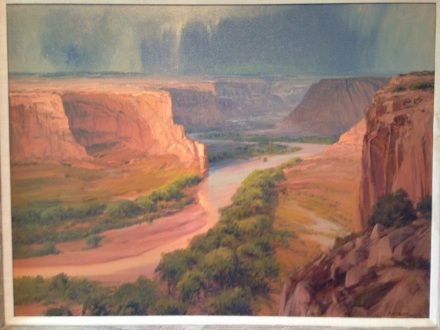
Rod Goebel’s painting depicts the Canyon de Chelly with the focus being on the water in the stream, as well as in the rain showers above. The perspective used shows the importance of water in this rocky terrain. The sinuous line of the stream draws the observer’s attention to it, and the stark difference in colors allow it to stand out against the brown backdrop. In addition to the water being the central focal point it also gives life to vegetation, which has the only other color that stands out. The importance of water in this scene illustrates the need to protect it.


The artist uses perspective to draw attention to the stream and rain shower. The blue coloring of far away points makes them appear to be in the distance while nearer objects in the frame have more detail. The hard lines of the rock formation compared with the curved lines show its motion. Taking the flowing motion of the stream as well as the falling rain into consideration, it becomes clear that water is always in motion. Moving across our planet with this water are many chemical pollutants that are used in farming and other industrial processes.


With the main focus of this painting being on the water that is such an important live giving force, perhaps the artist intended the audience to consider it’s vulnerability to pollution. Water is shown as giving life to the vegetation along its banks, and further out is a barren landscape. It becomes obvious that without the vital resource life would cease.


Water is also shown as a powerful force that has cut the canyon over a long period of time relative to our own short human timescale. This could possibly be illustrating the fact that conservation efforts must take varying timescales into consideration when constructing plans. One take away from this piece is that water is indeed a precious resource that is central to all environmental issues, and it needs to be used sustainably.


Monet and Our Decision

Image

Claude Monet

France, 1840-1926

La Berge à la Lavacourt (Riverbank at Lavacourt), 1879

Fred Jones Jr. Museum of Art, University of Oklahoma
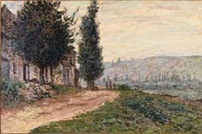
La Berge à la Lavacourt first struck me as a wonderful and passionate painting. Monet uses very heavy strokes, adding layers to make certain features pop, such as a part of the meadow in the foreground. It was this that my eye was first drawn to, and as I examined this beautiful meadow I felt a passion for the beauty of it. I then saw the trees, the beautiful garden, an old house or cottage; it was after these that I finally noticed the background. There is a single line of trees close to the river, and then desolation. The entire hill is bleak, with large swaths as brown as the dirt path. There seems to be what I can only guess are factories in the distance, and then I notice them. Two people strolling down the path, and it isn’t discernible whether they are coming to the beautiful meadow, or headed towards the destroyed hill.

It seems to me that Monet is trying to show us the two paths that humanity can take: one of nature and the other of industry. For me, this seems perfect to describe the anthopocene; do we come back to nature, or leave it behind forever scarred? It seems obvious to me where Monet believed us to be, by putting the only humans in the work on the path devoid of organic life. He himself, however, places the viewer in the meadow, and purposely draws us to the meadow first. Monet is almost willing us to side with nature, to see the beauty of it before disturbing us with the barren background. The work seems timeless, as it is just as relevant today, if not more so. We have an immediate decision to make, and as Monet illustrates, the beauty of nature is quickly disappearing to the anthropocentric world we live in.

Internal and External Change

Pieter Vermeersch, Belgium b. 1973. Untitled 4, 2011. Oil on Canvas.

The thing about this piece that grabbed my attention was the effortless changing of colors, the different shadings morphing into one another.

I generally notice the center-almost-circular, lighter, olive color area. The shadings of the different colors morph and bleed into one another. Depending on the different angle and lighting position you have, as well as the amount of time you stare into the painting, the colors seem to stretch out further than they do at first glance. The dark, black/blue at the bottom travels upward on both sides, leaving the middle untouched; the light, tan color at the top seems to push down with a straight pathway. The olive middle explodes out in all directions. The lack of brush strokes lead each color effortlessly into the surrounding areas.

These details lead me to think about certain aspects of existence and how they can change gradually over time without consciously noticing. Though the top, lighter section never fully reaches the bottom, darker part, if you take the painting as a whole the two sections are one in the same thing. People, societies, civilizations, creatures and animals all change over time, and from a day-to-day and week-to-week basis it can be fairly unnoticeable. All experiences combine to form the true self, they are all one in us; individually, the shading has no true beginning or ending, but all of the colors combine to from the true self. Change, even as basic as a form as this, is inevitable and feels so natural (similar to the naturalness of life and death). Not all change is good nor bad, so depending on how you approach it every aspect of life can equally weigh out with each other and cooperate to form inner peace. All creatures change, and most change their surroundings to better enhance their lives; if we continue to act and change, internally and externally, without noticing the change occurring, who knows what the end result will be.


Image

interconnectedness

Image

Adrian Arleo (U.S., b. 1960)
Lead (Woman with Two Horseheads), 2002
Ceramic
Gift of Mark Landrum, 2013
Fred Jones Jr. Museum of Art, The University of Oklahoma, Norman


The work of art I was particularly enthralled by is entitled “Lead (Woman with Two Horseheads).” At first glance, this sculpture is in itself quite unique, as it depicts a woman with two horse heads replacing her legs. As I studied it closer, however, I realized the significance and symbolism of this work. In an exploration of the interconnectedness that exists between humans and animals, the artist, Adrian Arleo, uses this work to portray just how similar humans are to animals, and therefore nature. Her use of clay can be seen as another way to connect this piece to the natural world. In order to inspire a primarily ecological interpretation of the work, and to portray the interdependence of all life on earth, she used uninterrupted horizontal striations on the both the woman and the horse heads. Arleo is known to focus most of her work on the human figure in combination with elements of the natural world, especially animal imagery. When describing her work and what she hopes to accomplish through it, she believes that people should come to discover that “we are made of the same substances and are all dependent upon the same elemental forces.”

The way this work fits into our concepts and study of the Anthropocene is obvious. The point of this piece is to show just how utterly connected we are to other species, to everything, on our planet. And there is no escaping that fact.


I picked one other work of art that I felt properly depicted the Anthropocene, a sketch on woodblock called “Aspen Summer” by Gustave Baumann, an artist who frequently sought refuge from urban life by spending many summers sketching the aspens of northern New Mexico. Although his work is quite beautiful and detailed, as he printed the greens of his sketching on woodblock, I thought its relation to the Anthropocene was quite ironic. Baumann used wood, perhaps even from the aspens in his favorite region, to artistically portray the beauty of trees, an anthropocentric irony I could not ignore. Which is more valuable, though, the depiction of the aspens on a block of wood, or the actual aspens left unharmed to be viewed in awe?